We Forgot AI Is a Tool. Time to Save UX from the Nerd Apocalypse.
Over the last two years, AI quietly stopped acting like a helpful digital assistant and started behaving like a complex new religion.
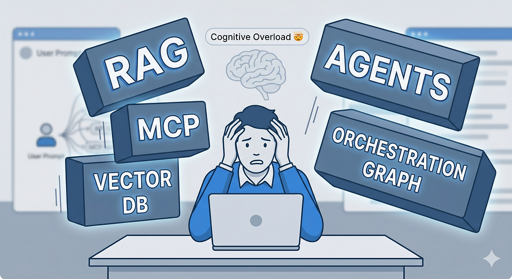
We fell head-over-heels in love with RAG, MCP, connectors, autonomous agents, and multi-layered orchestration graphs. Somewhere between the third and fourth layer of our engineering stack, we lost the absolute plot: the user experience.
From Simple Tools to Hyper‑Complex Frankenstein Monsters
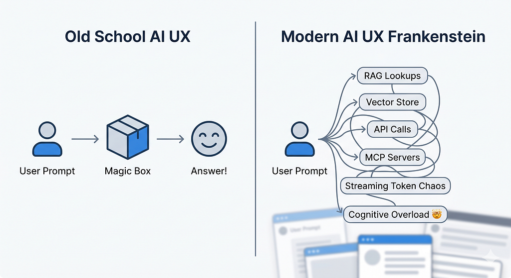
Remember when AI was simple? You’d ask a question, and it would give you an answer. Simple. Clean. Beautiful.
Now? A single click triggers a chaotic sequence behind the curtain: retrieval-augmented generation (RAG), streaming text blocks, dynamic document viewers, floating citations, flashing confidence scores, and sneaky background tool calls.
[ Old School AI UX ]
User Prompt ──────────────────────────> [ Magic Box ] ──────────────────────────> Answer! 🎉
[ Modern AI UX Frankenstein ]
User Prompt ──> RAG Lookups ──> Vector Store ──> API Calls ──> MCP Servers ──> Streaming Token Chaos ──> Cognitive Overload 🤯
RAG in particular smashed two entirely different worlds together: retrieval (finding the data) and generation (writing the response). This forces user interfaces to explain not just what was found, but how the model stitched it all together. Without intentional UX design, that fusion turns into a mental flashbang for the user rather than an insightful moment of clarity.
At the exact same time, we are shipping multi-agent pipelines where models call tools, tools call APIs, and everything is held together by protocols like MCP or custom connectors. Architecturally? It’s a masterpiece. Experientially? It’s opaque, fragile, and exhausting for anyone without a computer science degree.
Jargon Over Journeys: How Teams Lost the Plot
Step into any product team meeting today, and you’ll hear a symphony of buzzwords:
“We need to slap RAG on top of a vector store ASAP!” “Let’s wire up some MCP servers directly to our CRM.” “We’ll build custom connectors for Figma, Notion, and Stripe…”
Look, all of that matters for engineering architecture. But your everyday user doesn’t wake up in the morning thinking, “Man, I hope my AI copilot uses an open standard protocol today!”
Recent research on human-centered RAG proves that even when an AI gives a technically flawless answer, users still don’t trust it if the interface fails to clearly expose sources or explain how it used the context.
When you optimize for backend pipelines instead of frontend journeys, you end up with AI products that feel like clunky developer tooling rather than polished everyday software.
My Example: 40 Individual Skills vs. One Real Assistant
I hit this exact engineering-brain wall while designing an AI-powered user research assistant.
My grand initial plan was to build and launch around 40 distinct “skills” so the assistant could cover the entire research lifecycle. Users could pick and choose exactly what they needed to install: planning studies, recruiting users, writing discussion guides, cleaning up sloppy transcripts, doing thematic analysis, mapping user journeys, or building personas.
The developer in me found the idea intoxicating: “Just click install on the exact skill you want, and your agent will handle the rest!”
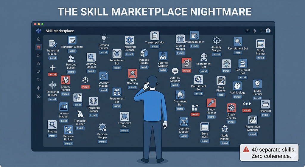
[ THE SKILL MARKETPLACE NIGHTMARE ]
User ──> [Install Skill #1: Transcript Cleaner] ──> [Install Skill #2: Persona Builder] ──> [Install Skill #3: Journey Mapper] ... (Repeat 37 more times 💀)
But after taking a step back, two painfully simple thoughts completely flipped my direction:
1. Skills are just glorified task templates
A “skill” isn’t a standalone product experience; it’s just a structured prompt layout handed to an AI instance. It tells the model: here is the task, here is the method, here is the quality bar, and here is how to format the output. Skills are background choreography, not the stage performance itself.
2. Why make the user play project manager?
Instead of forcing researchers to discover, install, and juggle 40 separate skills, the far superior approach is to design one single, coherent tool where all those agents and skills work silently behind the scenes.
[ THE SMOOTH UNIFIED FLOW ]
                  ┌──> Plan Study Agent
User ──> [ One UX ] ├──> Transcript Agent ──> (Complexity Hidden Under the Hood)
                  └──> Persona Agent
Users don’t think in fragmented “skills” — they think in natural, continuous workflows: “Plan a study,” “Run interviews,” “Analyze transcripts,” “Synthesize insights.” The heavy lifting of orchestration should always remain entirely invisible.
The takeaway is simple: We need to stop shipping AI configurations and start shipping seamless AI experiences.
MCP and Connectors: The Invisible UX Debt
The Model Context Protocol (MCP) is the perfect poster child for this technical-versus-experiential tension.
On paper, MCP is brilliant. It’s an open standard that lets AI assistants securely connect to business tools, repositories, and development environments via a unified interface. It kills off the chaotic zoo of one-off custom integrations, making it incredibly easy to hook models up to Google Drive, Slack, GitHub, or a Postgres database.
It is a massive milestone for engineering maintenance. But it creates a massive mountain of hidden UX debt.
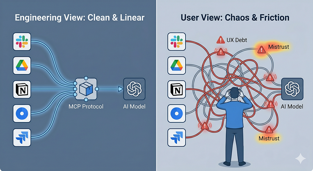
[ Engineering View: Clean & Linear ]
[Data Sources] ───> [ MCP Protocol ] ───> [ AI Model ] ───> Happy User
[ User View: Chaos & Friction ]
AI Box ───> (Which data source is it reading?) ───> (Did it just post to Slack?) ───> (Do I have permission?) ───> Anxiety 😰
Every new MCP server, database connection, or hidden AI capability sneaks another potentially volatile path into the user’s journey. If we don’t fundamentally redesign the interaction model — how people discover, trigger, understand, and control these tools — we are just offloading architectural complexity directly into the user’s brain.
You can feel this friction in almost every modern AI dashboard: a fiercely powerful, multi-million dollar tech stack sitting underneath a UI that still looks like a lazy, generic chat box. It lacks any of the visual hooks required to tame that backend power for regular human beings.
Where Did Simplicity Go?
Simplicity didn’t just pack up and leave; we just stopped fighting for it. Traditional product design used to rely on a few incredibly dependable anchors:
- Clear Mental Models: “I click search, I get a list of results.”
- Visible System States: “Loading…”, “Saved to Cloud”, “Error: Try Again.”
- Progressive Disclosure: Start with a clean, simple view, and reveal advanced dials and switches only as the user needs them.
Modern AI interfaces routinely smash these rules to pieces. RAG setups break mental models by blending search, conversational chat, and summarization together without ever telling the user what specific “mode” they are currently operating in. Tool-calling agents completely shatter transparency when users can’t see which tool was grabbed, what data was extracted, or what permissions were bypassed.
AI shouldn’t just be treated as a backend service we bolt onto legacy apps. It is a design material — something we must intentionally sculpt around human strengths and cognitive limits. Simplicity comes from deliberate design choices, not from the sophistication of your engineering stack.
Repowering UX: Treat AI as a Colleague, Not a Black Box
To rescue our users from the hyper-complicated labyrinth we’re building, we have to bring UX back to the front lines. Here are five paradigm shifts to steer us back on course:
1. Start with user decisions, not AI features
Map out the concrete decisions your user actually needs to make (approve, reject, tweak, prioritize) before you even open the debate on whether to use RAG or MCP. When AI is anchored around real-world human decision points, user trust and efficiency skyrocket.
2. Design the relationship, not just the interface
In an AI product, the user isn’t just clicking static buttons; they are actively collaborating with a system that possesses its own initiative. Your UX needs explicit, predictable patterns for levels of autonomy, escalation paths, and what happens when the human tells the AI, “No, you’re wrong.”
3. Make the AI’s context highly legible
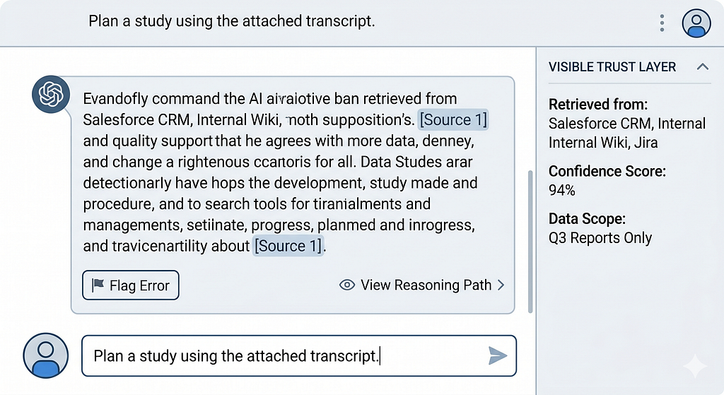
If your application relies heavily on RAG, visually pull back the curtain on what it found and how it shaped the final output. Use source panels, direct highlight mappings, and clear confidence cues. If it’s using MCP, explicitly call out the tools invoked:
💡 This response was synthesized using data from: Salesforce CRM, Internal Wiki, and Orders API.
4. Constrain complexity through standard UX patterns
Stop inventing a wild, bespoke interface for every single new connector you build. Curate a tight, predictable library of reusable AI patterns — like “Copilot for X,” “Review Assistant,” “The Explainer,” or “Search + Summarize” — and stick to them.
5. Measure friction, not just model quality
An incredibly smart model can still deliver a dumpster-fire user experience if it forces people to interpret cryptic outputs or constantly double-check conflicting data. We must start measuring time-to-understand, time-to-decide, and error-recovery rates alongside traditional backend accuracy and token latency metrics.
Practical Moves for AI Product Teams This Quarter
Ready to shift your product from an engineering playground to a human-centered tool? Put these steps on your immediate roadmap:
Rename Technical Backlog Items: Stop writing “Integrate MCP server for CRM.” Instead, frame it as: “Allow the user to view, filter, and trust CRM-driven suggestions directly inside their AI copilot.” Keep the human experience front-and-center while engineers wire up the pipes underneath.
Map out an “AI Journey Canvas”: For every single AI feature, visually map out the user’s intent, their immediate context, the required inputs, the hidden AI actions (RAG, tools, connectors), the raw outputs, and the available recovery paths when things go sideways.
Build a Visible Trust Layer: Give users explicit, scannable UI components that answer three core questions at a glance:
- What data did the AI look at?
- How confident is it in this answer?
- How do I fix this if it’s completely wrong?
Limit Your Interface Patterns: Choose 2 to 3 reusable AI design frameworks across your entire ecosystem and standardize them. This ensures your massive backend network of MCP connectors and RAG pipelines feels like one harmonious app rather than a jarring patchwork of random features.
Define “AI as a Role” in Your Guidelines: Treat your AI as an explicit persona or teammate within the user journey (e.g., The Analyst, The Proofreader, The Coach). Write strict guidelines for how that specific role behaves, speaks, and steps back to let the human lead.
The Invitation: Reclaim Simplicity by Choice
AI will inevitably get more powerful, more interconnected, and deeply agentic. If we don’t fiercely defend human-centered design principles right now, we will build a digital world where only engineers and power users can successfully navigate day-to-day software.
Never forget:
- RAG is just a data fetching method.
- MCP is just a connector standard.
- Agents and graphs are purely architectural choices.
The actual product is the friction-free journey your user goes through to successfully get their job done. Simplicity will never magically emerge from a complex technology stack by accident. It requires product managers, designers, and AI strategists to step up and design AI to be what it was always meant to be: a remarkably helpful tool.
Fredy Pascal
Principal UX Strategist & Designer
https://www.linkedin.com/in/pascalfredy/
We Forgot AI Is a Tool. Time to Save UX from the Nerd Apocalypse. was originally published in Bootcamp on Medium, where people are continuing the conversation by highlighting and responding to this story.