Stop Reporting “Task Completion.” Start Reporting Revenue Impact.
A guide for designers who want to influence business decisions and finally bridge the gap between empathy and economics.
Picture the scene: You are in a quarterly review with senior leadership. You’ve spent weeks researching user pain points on the checkout flow. You have the data. You pull up your slides.
- “We ran usability tests with 15 participants.”
- “The average System Usability Scale (SUS) score was a 68.”
- “Heatmaps show users are missing the ‘Continue’ button.”
- “Time-on-task is currently averaging 4 minutes.”
You look around the room. The VP of Product is checking their email. The CEO is looking at the clock. They nod politely, say “Interesting insights,” and move on to the next agenda item about quarterly revenue targets.
You didn’t get the budget for the redesign. You didn’t get the buy-in.
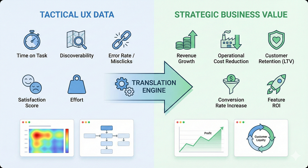
Why did this happen? Your research wasn’t flawed. Your design isn’t bad. The problem is that you were speaking one language (Tactical UX), and your audience was speaking another (Strategic Business).
If you want a seat at the table, you have to stop acting just like a researcher and start acting like a translator.
The Great Translation Gap
Designers and business leaders are both working toward the success of the company, but they measure that success differently.
UX teams measure the health of the experience: Are users happy? Can they find things? Is it efficient?
Business leaders measure the outcome of that experience: Are we making money? Are we saving money? Are we keeping customers?
When you present tactical metrics like “clicks” or “satisfaction scores” to a C-suite executive without connecting them to financial outcomes, you are asking them to do the math in their heads. They won’t do it. They are focused on risk, cost, and revenue.
To influence decisions, you must convert your empathy data into economic data.
The Translation Guide: From UX to ROI
You don’t need an MBA to do this. You just need to understand what keeps your stakeholders up at night and map your user behaviors to those anxieties.
Here is how to translate common tactical UX metrics into strategic business levers.
1. The Metric: Time on Task
The Translation: Operational Cost Reduction
- The Old Way: “Users are taking 5 minutes to fill out this internal intake form. We need to reduce the steps to make it faster.”
- Why it Fails: Leadership hears “faster is nice to have,” but it’s not urgent.
- The New Way: “We have 500 internal employees filing this form three times a week. By redesigning the flow and shaving just two minutes off the task time, we will save the company roughly 250 employee hours per month. Based on an average hourly wage of $40, this redesign will yield $120,000 in annualized operational savings.”
- Why it Works: You’ve turned “efficiency” into hard cash saved on the bottom line.
2. The Metric: High Error Rates / Missing Clicks
The Translation: Support Cost Avoidance
- The Old Way: “Our heatmaps show users are confused by the navigation, leading to a high error rate on the settings page.”
- Why it Fails: It sounds like a minor annoyance that users should just figure out.
- The New Way: “I synced with the Customer Support team. That confusing navigation is currently triggering roughly 200 support tickets every week. At an estimated cost of $8 per ticket, this bad UI is costing us $6,400 a month. Fixing this navigation should reduce related ticket volume by at least 30%, saving the business nearly $25,000 a year in support costs.”
- Why it Works: You have directly linked bad design to an unnecessary expense line on the P&L.
3. The Metric: Drop-off Rate
The Translation: Revenue Leakage and Wasted CAC
- The Old Way: “We are seeing a 60% drop-off rate on the second step of the sign-up flow. We need to improve the form design.”
- Why it Fails: It sounds like a generic “conversion optimization” task that can wait.
- The New Way: “Marketing is currently spending roughly $20 (Customer Acquisition Cost/CAC) to get a user to that sign-up page. When 60% drop off because the form is cumbersome, we are essentially burning 60 cents of every marketing dollar spent. By streamlining this step, we can plug this revenue leak and increase the ROI of our entire ad spend.”
- Why it Works: You aren’t just talking about design; you are talking about protecting the marketing department’s investment.
4. The Metric: Satisfaction / Usability Scores
The Translation: Impact on Retention and LTV (Lifetime Value)
- The Old Way: “Our new dashboard design has improved user satisfaction scores by 15 points!”
- Why it Fails: “Satisfaction” is a fuzzy metric to a CFO.
- The New Way: “Data shows that highly satisfied users are 3x less likely to churn at renewal time. By improving the usability of the dashboard, we are directly impacting customer retention. A 5% increase in retention can lead to a 25–95% increase in profit over time by securing the Lifetime Value (LTV) of that customer.”
- Why it Works: You are connecting a feeling (satisfaction) to the long-term stability of the company’s recurring revenue.
A Framework for Your Next Presentation
How do you actually do this? You can’t just make the numbers up. You need to step outside the design silo and build relationships with other departments.
Before you begin your next project or present your findings, follow these steps:
Step 1: Find the Baseline Cost
Don’t guess. Go talk to the Customer Success lead and ask, “ How much does a support ticket cost us?” Talk to an engineering lead and ask, “What is our average hourly rate for internal tools?” Talk to marketing about CAC. You need these financial variables to build your equation.
Step 2: Measure the Behavior (The “Before”)
Gather your tactical UX data. What is the current time on task? What is the current error rate?
Step 3: Do the Math
Multiply the behavior by the baseline cost. (e.g., 1,000 errors a month * $10 per support ticket = The cost of the problem).
Step 4: Present the Solution as an Investment
When you propose your redesign, present it as a business case. “We believe investing $X in design resources to fix this flow will result in a return of $Y in cost savings within six months.”
Conclusion
Your stakeholders don’t want to know how the sausage is made; they want to know how much the sausage costs and how much they can sell it for.
Tactical UX metrics — heatmaps, time-on-task, click-tracking — are vital tools for us to diagnose problems and design good solutions. But they are not the tools for selling those solutions to leadership.
If you want your work to be valued, you need to communicate its value in the currency of the business. Stop reporting on the output of your design, and start reporting on the outcome for the business.
Fredy Pascal
Principal Service & Strategy Designer
caio ciao
Stop Reporting “Task Completion.” Start Reporting Revenue Impact. was originally published in Bootcamp on Medium, where people are continuing the conversation by highlighting and responding to this story.