Design Services Like the Duffer Brothers Run the Upside Down
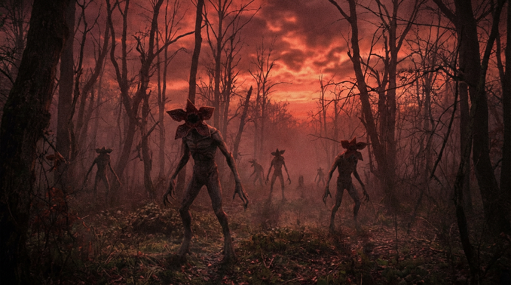
Let’s be honest: Stranger Things isn’t just a TV show. It’s a cultural juggernaut that somehow convinced the entire world to buy Eggos and listen to Kate Bush again.
But if you look past the Demogorgons and the excessive amount of hairspray, the creators — The Duffer Brothers — aren’t just telling ghost stories. They are master architects. They have engineered a repeatable, scalable system for engagement that resonates across demographics and withstands network rejection.
As Service Designers, we often get stuck in the weeds of wireframes, Jira tickets, and “Marketing Mary” personas. But what if we swapped our standard Agile methodology for the Duffer Brothers’ Storytelling Framework?
Here is how to stop designing abstract services and start architecting experiences that feel like blockbusters.
1. The “Two-Week Rule”: Why You Should Procrastinate on Pixels
The Duffer Brothers operate on a rule that sounds terrifying to most creatives: they spend months outlining the structure and only about two weeks writing the actual script.
Their logic? “If the outline is strong, the script writes itself.” They treat filming like Alfred Hitchcock did — as a mere formality to capture the planning.
The Service Design Translation: Stop rushing to Figma. If you are opening your design software in Week 1, you’ve already lost.
We need to flip our time allocation. Spend 60–70% of your project timeline on Service Blueprinting — the structural scaffolding. This is the unsexy work of mapping backstage processes, API calls, and support tickets all designed to support user intent and needs.
If your scaffolding is solid, the UI (the “script”) becomes a formality. If your scaffolding is weak, no amount of beautiful and usable UI will save the service from collapsing like a house of cards.
2. The “Montauk Bible”: Selling the Vibe, Not the Spec
Before Stranger Things was Stranger Things, it was a pitch deck called “Montauk.” But it wasn’t a boring list of character bios and budget spreadsheets. It was designed to look like a battered, paperback Stephen King novel. It was filled with grainy photos of E.T. and Poltergeist.
They didn’t sell the plot; they sold the nostalgia. They hacked the executives’ brains by triggering emotional memories before explaining the logistics.
The Service Design Translation: Nobody reads your 50-page requirements document. Instead of boring stakeholders with process flows, create a “Service Bible.” This is a visual artifact — a high-fidelity mood board — that communicates the feeling of the service.
If you are designing a banking app for Gen Z, don’t write “users want transparency.” Show pictures of indie coffee shops, vintage Polaroids, and unfiltered Instagram stories. Create an “Emotional Prototype” that gets stakeholders nodding their heads before they even know how the login screen works.
3. The “Demographic Layer Cake”: The Genre Mashup
How does moments in Stranger Things appeal to a 12-year-old (Will) and a 40-year-old (Hopper) simultaneously? The Duffers built a Layer Cake:
- The Kids: A horror/adventure (Stephen King style).
- The Teens: A slasher/romance (John Carpenter style).
- The Adults: A sci-fi conspiracy (Steven Spielberg style).
These aren’t separate shows; they are stacked on top of each other.
The Service Design Translation: Stop building separate flows for distinct demographics. Build one flow that serves different Mindsets simultaneously at the same time for the same goal and phases.
Your service needs to be a Layer Cake:
- The Novice (Safety-Seeker): Needs the “Kids” layer — wizards, clear guides, and safety rails.
- The Power User (Efficiency-Seeker): Needs the “Teens” layer — autonomy, shortcuts, and freedom.
- The Explorer (Discovery-Seeker): Needs the “Adult” layer — deep data, hidden patterns, and “conspiracy” level details.
4. Personas Born from Conflict (The D&D Method)
Traditional personas are often useless: “Meet Marketing Mary. She likes coffee and owns a cat.” Who cares?
The Duffer Brothers introduce characters through conflict. In the opening D&D scene, the boys argue. Immediately, we know: Mike is the leader, Lucas is the skeptic, and Will is the vulnerable one. We didn’t need their bios; we saw them make choices under pressure.
The Service Design Translation: Burn your static persona sheets. Replace them with “Conflict Canvases.”
Don’t ask who the user is. Ask how they behave when the service breaks for example and what is their goal.
- Scenario: Sarah is at the airport, 10 minutes to boarding, and the app crashes.
- The Reveal: Does she call support (seeking humanity)? Does she furiously refresh (seeking control)? Does she give up (low trust)?
Design for the conflict, and you design for the truth.
5. The “Steve Harrington” Pivot: Listen to the Asset
Here is a fun fact: Steve Harrington (the guy with the great hair — Djo) was supposed to be a generic villain who dies in Season 1. But the actor, Joe Keery, was so charming and interesting that the Duffer Brothers threw away their plan and rewrote the show to make him a hero.
They followed the “Asset” rather than the “Plan.”
The Service Design Translation: This is the hardest pill for designers to swallow. Sometimes, the users will use your product in a way you didn’t intend.
- Slack started as a video game. The game failed, but the chat tool was fire.
- Instagram started as a check-in app. Nobody checked in, but everyone posted photos.
If your user testing reveals that people are ignoring your main feature but obsessing over a side feature, don’t force them back to the happy path. Pull a “Steve Harrington.” Rewrite the season around what is actually working.
6. Convergence: The Architecture of Revelation
The climax of every Stranger Things season follows the same pattern: The kids, the teens, and the adults — who have been solving different parts of the puzzle — finally meet up. They share their info, the lights flick on, and they realize how to kill the monster.
The Service Design Translation: This is about Information & Process Architecture and Handoffs.
In a complex service (like healthcare), the patient, the doctor, and the insurance agent are all on different “storylines.” A bad service keeps them separated (silos). A good service designs the Convergence Point over time for the same goal to achieve breaking silos.
Use swim-lane diagrams to map where these storylines intersect. Ensure that when the “Patient Storyline” meets the “Doctor Storyline,” the information handoff is seamless. If the characters don’t talk, the monster wins.
The Duffer Design Toolkit
Ready to implement this?
Tool 1: The Service Bible Template
Goal: Establish the emotional “North Star” of the project. If the Service Blueprint is the skeleton, this is the soul.
Page 1: The Cover
The Logline: One sentence that captures the hook. (e.g., “It’s not a banking app; it’s a financial therapist for anxious millennials.”)
Page 2: The Nostalgia Anchors
- If this service were a movie, it would be: (e.g., Ferris Bueller)
- If this service were a physical space, it would be: (e.g., A quiet library)
- If this service were a sound, it would be: (e.g., The click of a premium car door)
Page 3: The Mood Board
Paste images here. No text allowed. Focus on textures, lighting, and authentic human interaction.
Page 4: The Anti-Bible
The Enemy: Define what the service is NOT.
(e.g., “The Enemy is ‘Confusion’. Any screen that requires reading a manual is a failure.”)
Tool 2: The Conflict Canvas
Goal: Replace static personas with characters defined by stress.
The “Airport App” Example
The Character Sarah: Late for a flight, carrying two bags and a coffee.
The Inciting Incident: Gate change notification received 10 mins before boarding.
The Stress Test: The app logs her out for “security” and asks for a password she doesn’t know.
The Reaction
(A) Fight: She clicks furiously.
(B) Flight: She abandons app.
(C)Freeze: She panics.
(Design for the specific reaction)
The Hidden Value: She claims to value Security, but in this moment, she values Speed.
The Takeaway
The magic of Stranger Things isn’t the supernatural elements; it’s the structure.
The Duffer Brothers prove that if you architect the experience correctly — prioritizing structure over script, vibe over description, and adaptation over rigid planning — the result isn’t just a product. It’s a phenomenon.
So, stop writing scripts. Start building the scaffolding.
Fredy Pascal
Principal Service Designer
Ciao Ciao
Design Services Like the Duffer Brothers Run the Upside Down was originally published in Bootcamp on Medium, where people are continuing the conversation by highlighting and responding to this story.